Building and Scaling a Design System in Figma
Focusing on Color and Typography Tokens and Components
Role
Design system Designer
Project Type
Self-Initiated Project
Team
1 Design system Designer
1 Software Engineer
1 Design system Designer
1 Software Engineer
Duration
5 weeks
Are you interested to know my skills on building a design system?
Are you interested to know my skills on building a design system?
Objective
Objective
This project was created to explore how to build a design system from scratch and to understand the reasoning behind each decision. I included it in my portfolio to reflect my interest in design systems and systems thinking, with a strong focus on building a design system that is both designer- and developer-friendly.
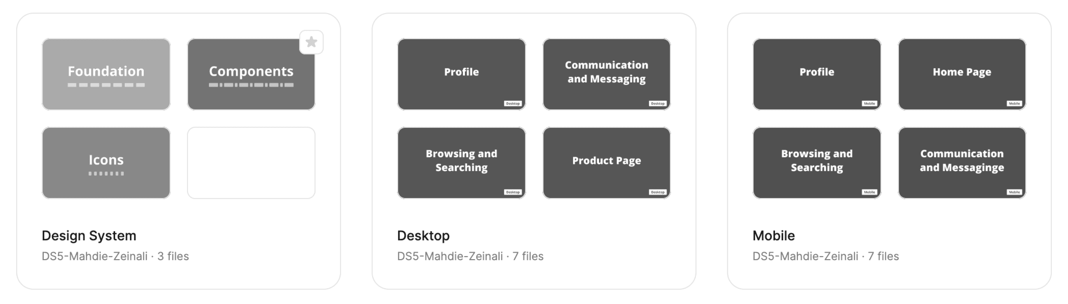
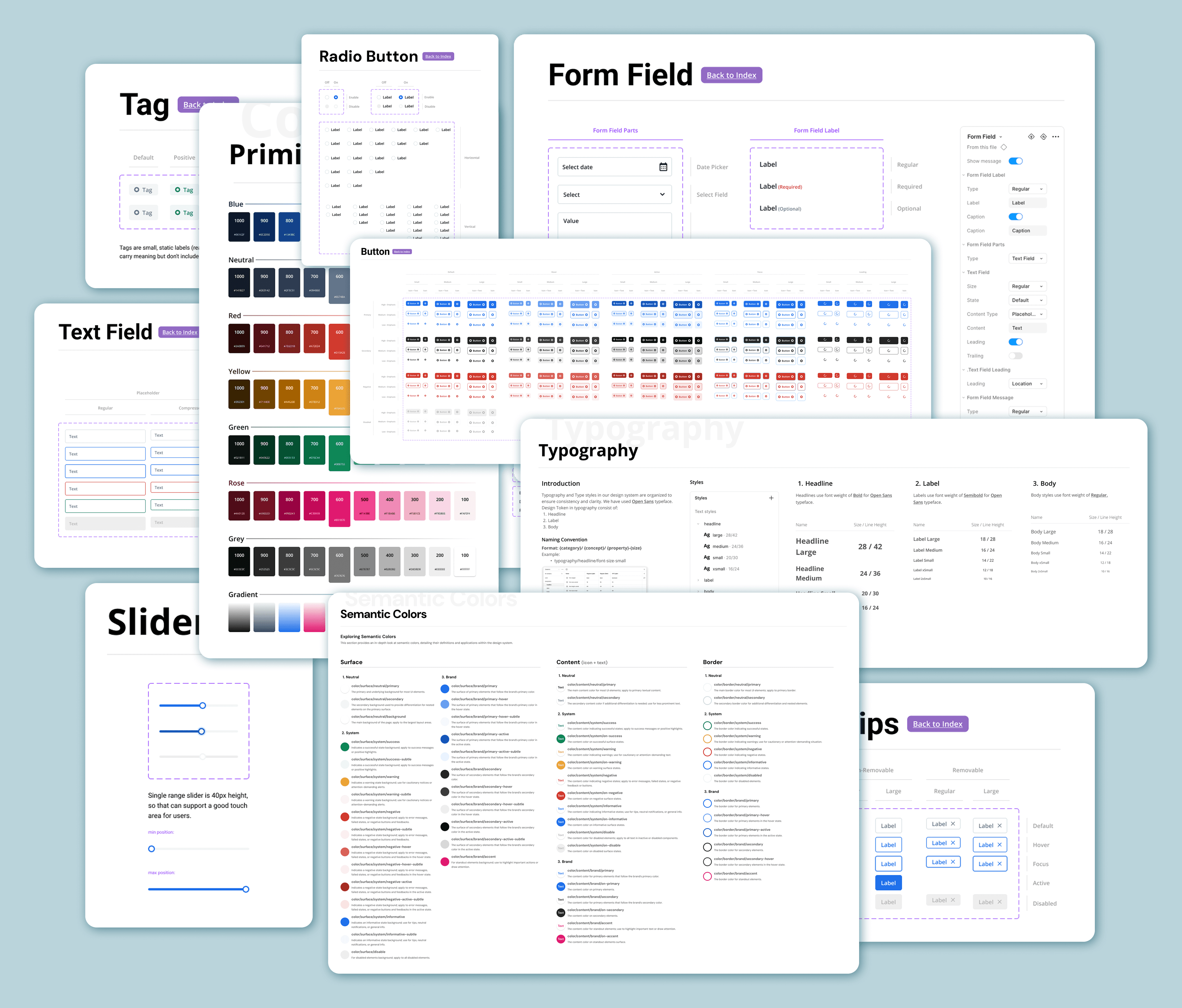
File management
I created a separate project in Figma to organize the design system. This made the structure more focused and allowed for better control of documentation, tokens, and components.
Foundation
Since this design system was made for a concept project, I focused on foundational design elements like: View in Figma.
Colors
Typography
Design Token Strategy
As part of building a scalable and maintainable design system, I established a naming convention for design tokens that works across different themes, components, and use cases. This convention was debated and refined in collaboration with a developer and another designer to ensure its effectiveness.
❌ What Didn’t Work: Component-Based Token Naming
At first, I experimented with component-based token naming alongside semantic general tokens. I implemented them, but it didn’t feel right. This structure made the system rigid, noisy, and hard to maintain. Problems I faced:
Repetition: Tokens were duplicated across components.
Scalability: As I added more components and states, the token list became overwhelming.
Poor reusability: Tokens were too tightly coupled to component names, making them less flexible.
✅ Transition to Semantic Token Naming
To solve this, I moved toward a semantic naming system, separating what a token is from where it’s used.
I removed component names from tokens and instead organized them by intent and interaction, resulting in a scalable and abstract structure.
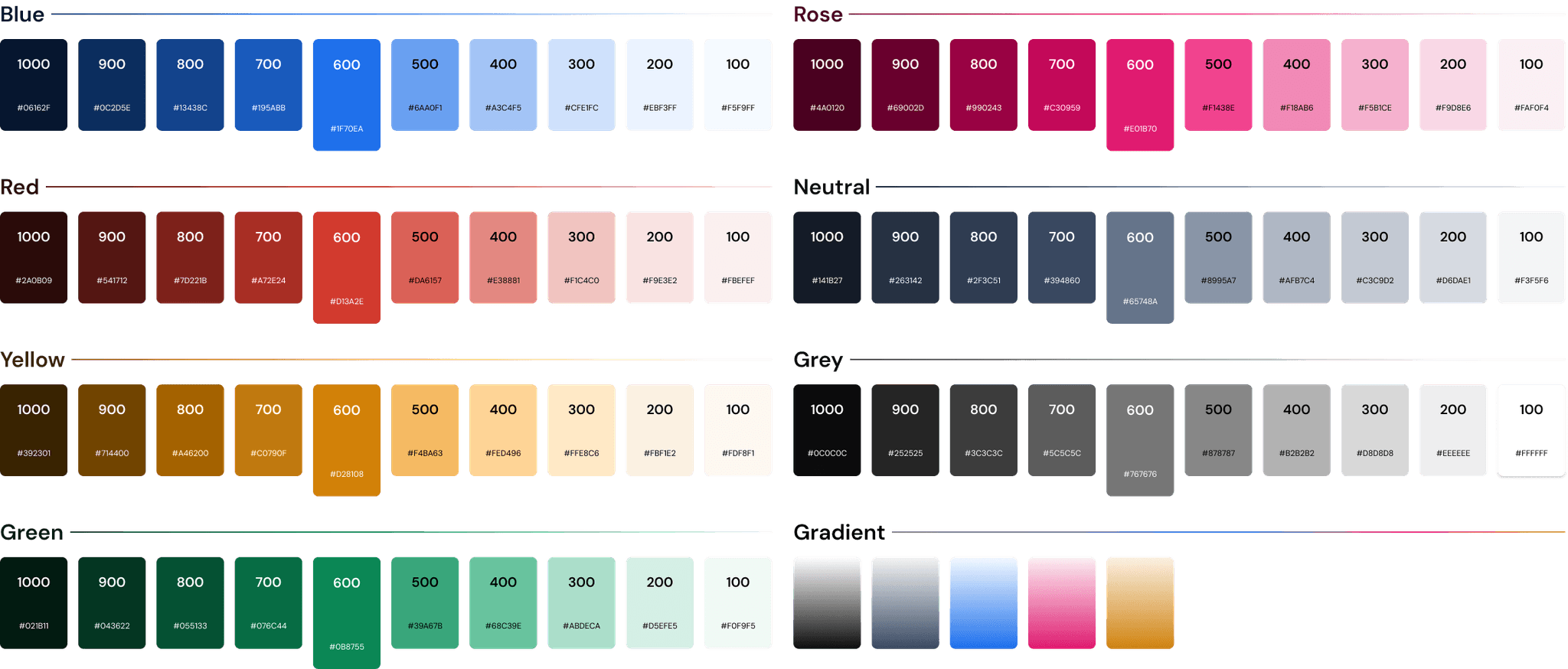
Color Tokens
1. Primitive Tokens
Raw, brand-agnostic values — not tied to any component or usage context. Examples:
colors/neutral/neutral100
colors/red/red500
colors/blue/blue600
colors/green/green200
Naming Format: {category}/ {name}/ {nameX}
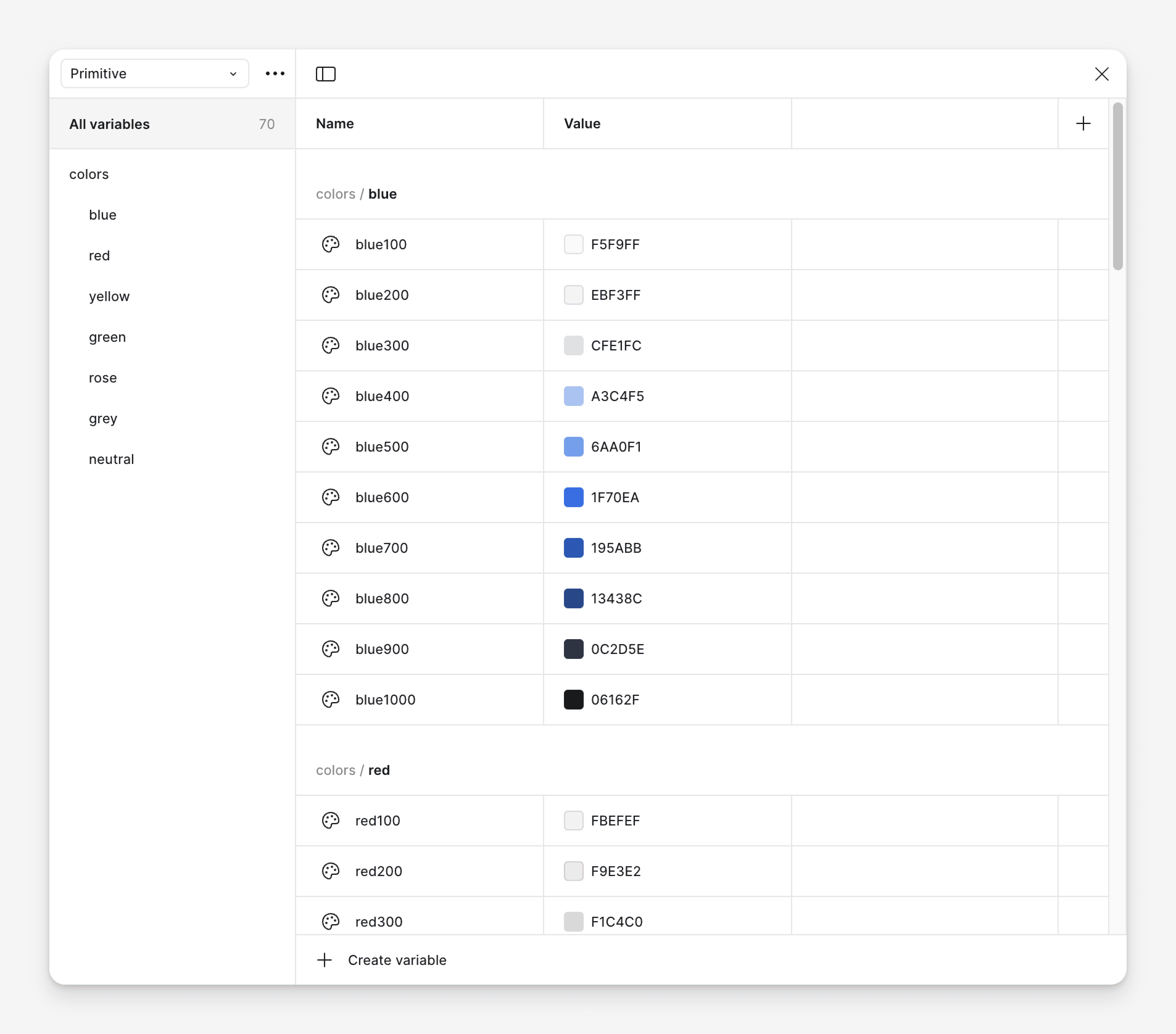
Generating Tints and Shades
The main colors were selected first, with tints and shades generated via HSB adjustments and validated for accessibility using contrast checks. Colors should be based on the brand color in real-world projects.
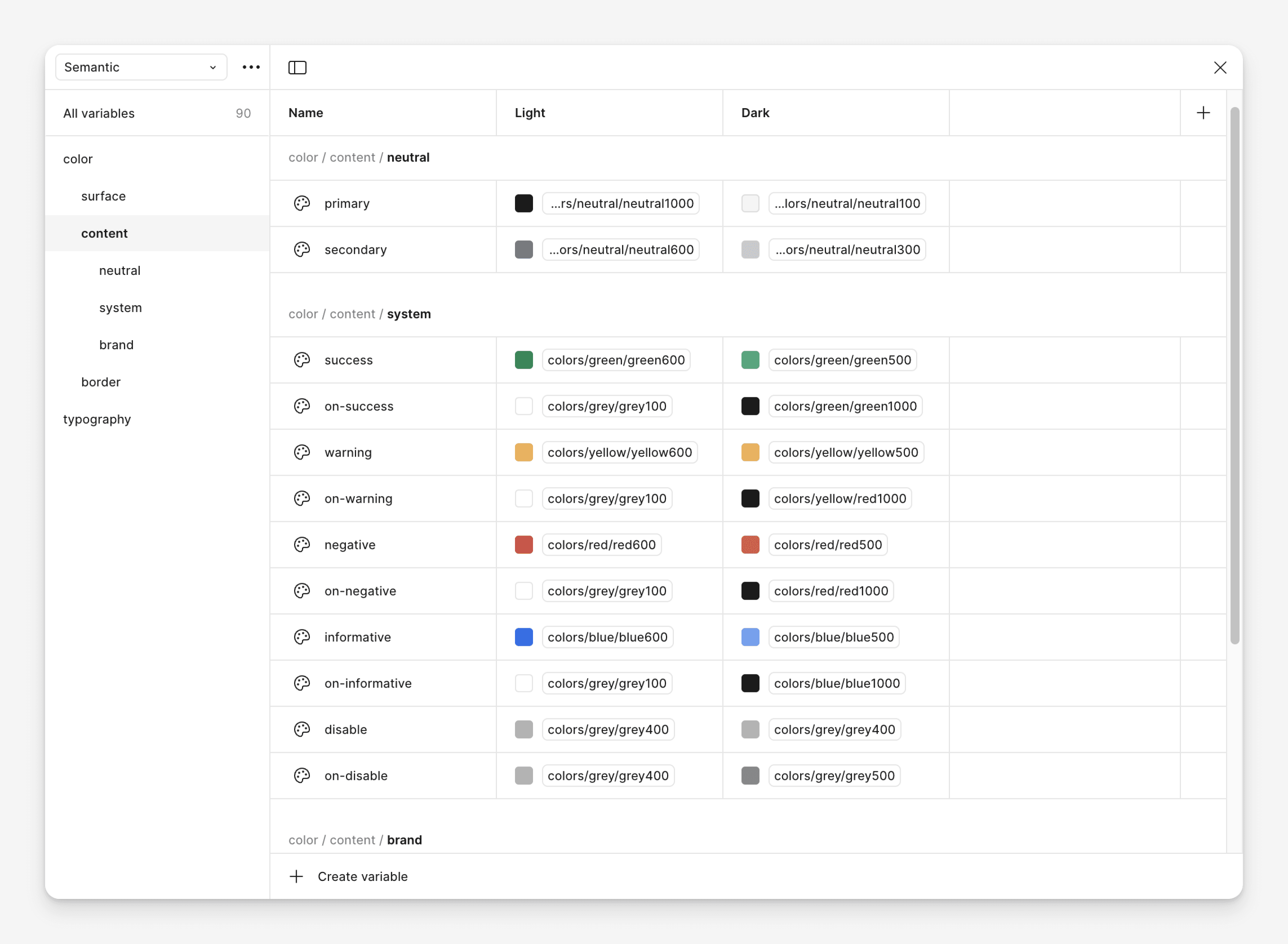
2. Semantic Tokens
These describe the role or meaning of a design decision. I grouped color tokens into the following categories:
colors/surface/*
static background areas (e.g. pages, cards)
colors/border/*
borders and outlines with no interaction
colors/content/*
icons and text colors
Naming Format: {category}/ {property}/ {concept}/ {variant}-{state}-{tone}
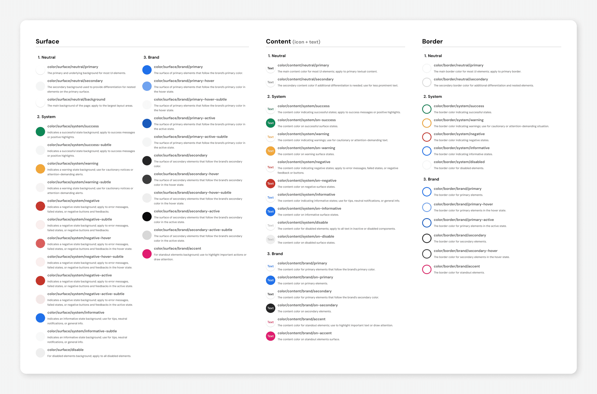
3. Color Document
I created a complete, categorized color token document to help designers quickly find and apply the right token. It’s structured by property (surface, border, content) and concept (neutral, system, brand) for clarity and consistency.
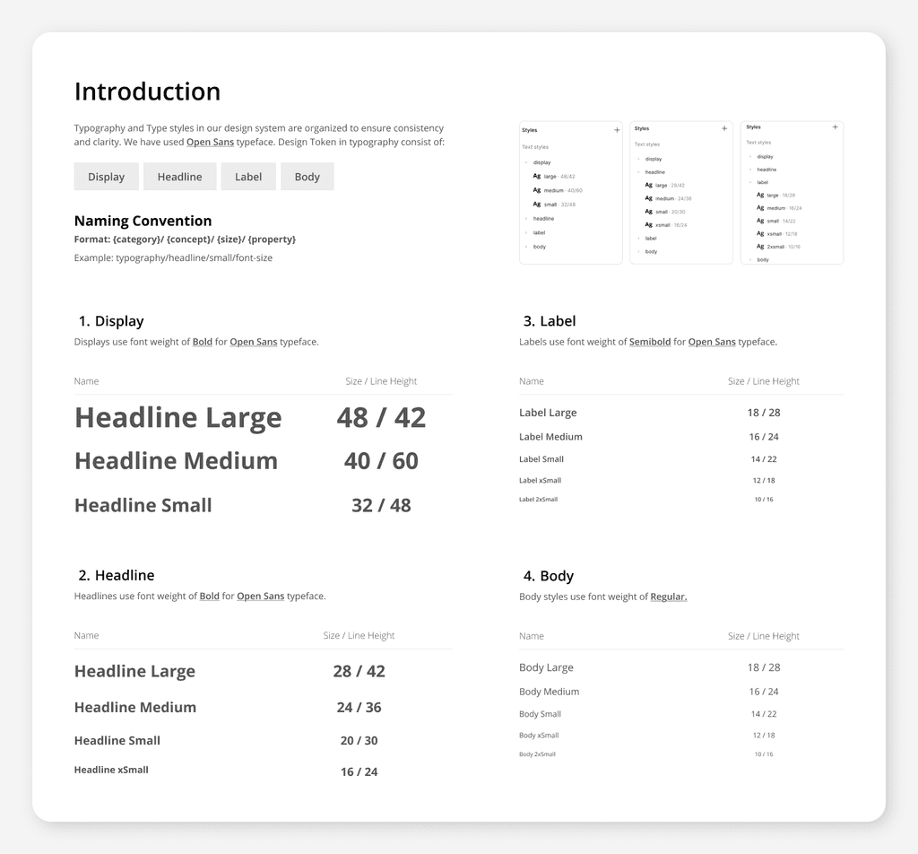
Typography Tokens
Technically, we could separate typography tokens into primitive and semantic layers, just like we do with colors. But in this project, I assumed typography styles would remain the same over time. That’s why I chose not to separate them and placed them directly in the typography collection to avoid repeating values unnecessarily. View in Figma.
typography/display/*
typography/headline/*
typography/label/*
typography/body/*
Naming Format: {category}/ {concept}/ {size}/ {property}
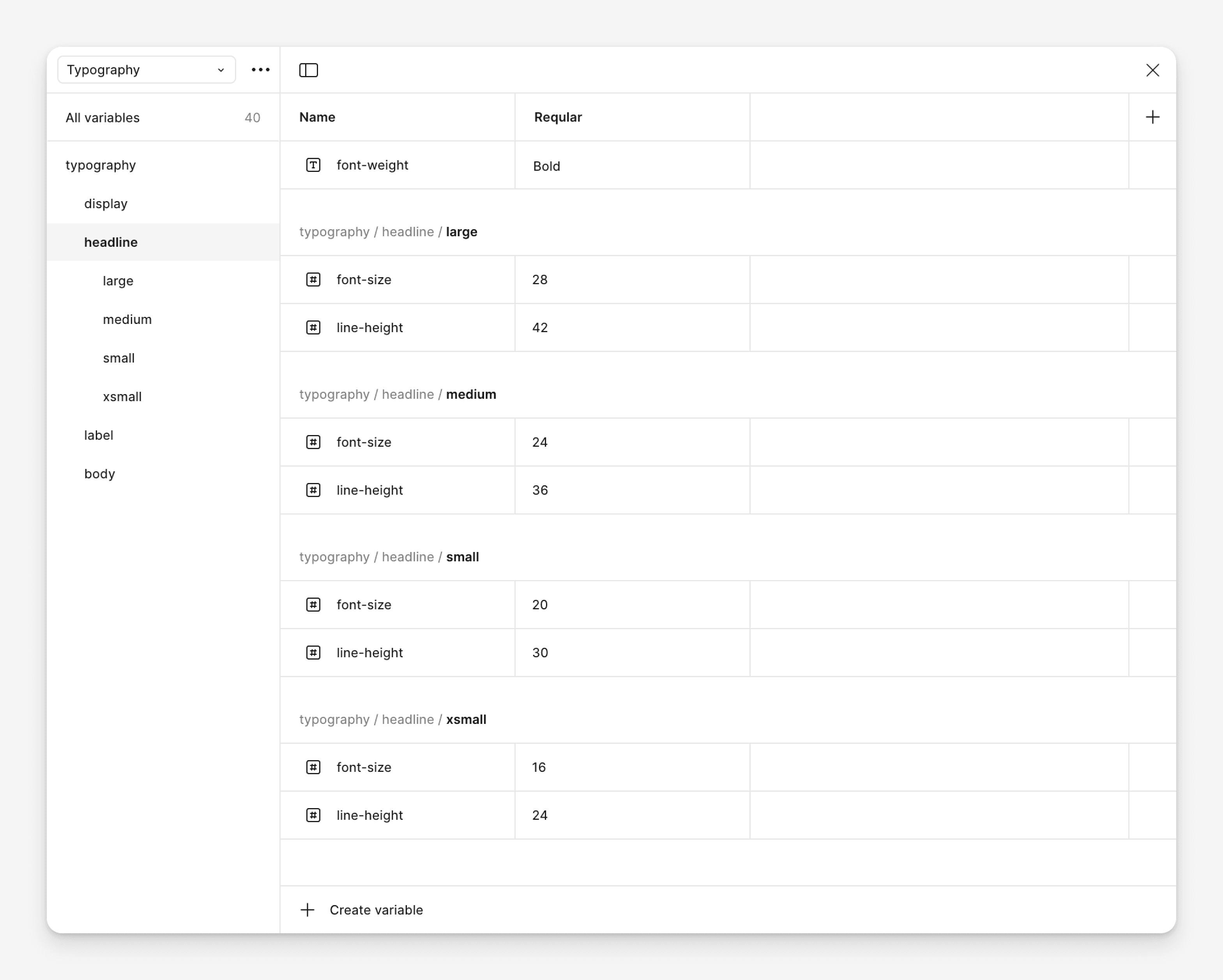
Typography Document
I created a comprehensive typography token system and defined corresponding text styles, making it easy for both developers and designers to use them consistently in their work.
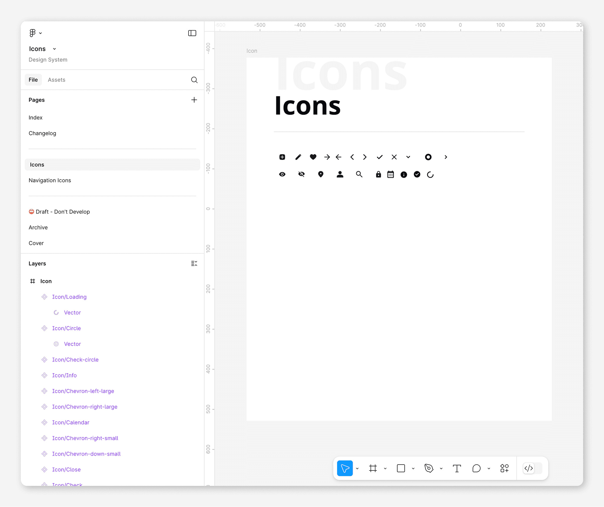
Icons
All icons were created as 24px components. I followed a naming convention that starts with
icon/to keep them grouped and easily searchable in Figma. View in Figma.
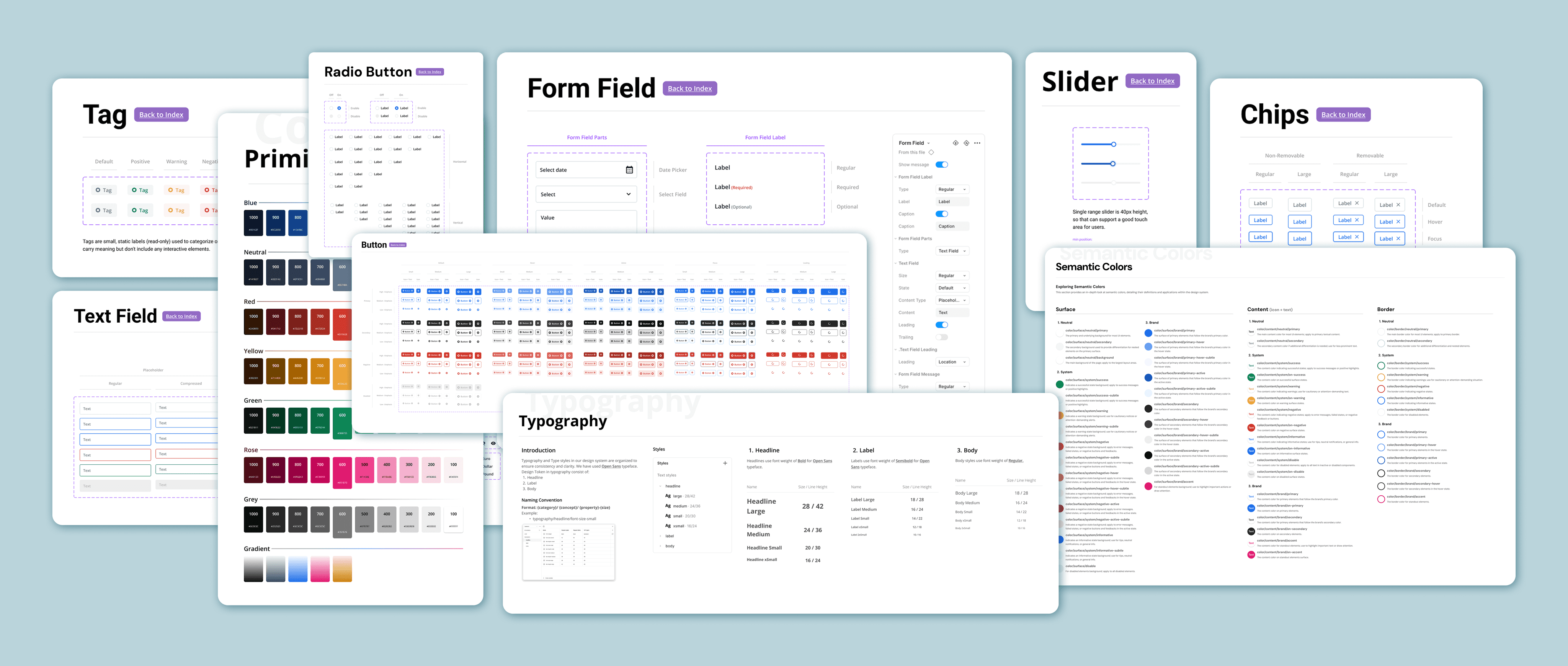
Components
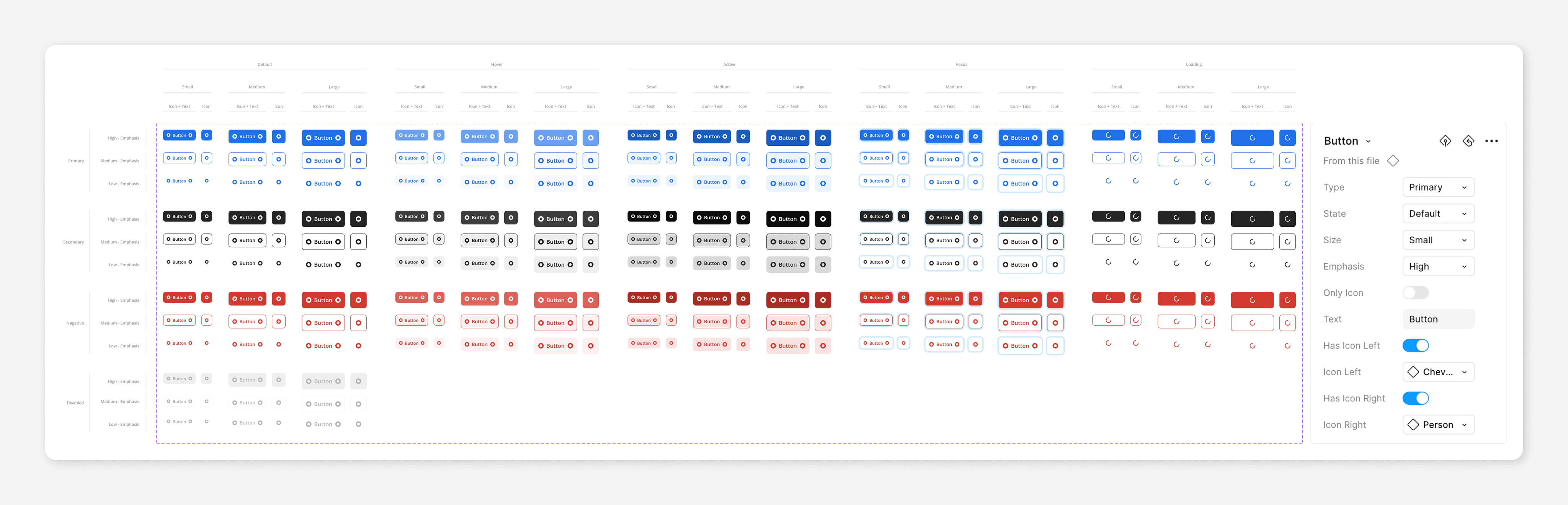
Button
Radio Button
Checkbox
Toggle
Text Field
Select Field
Date Picker
Text Area
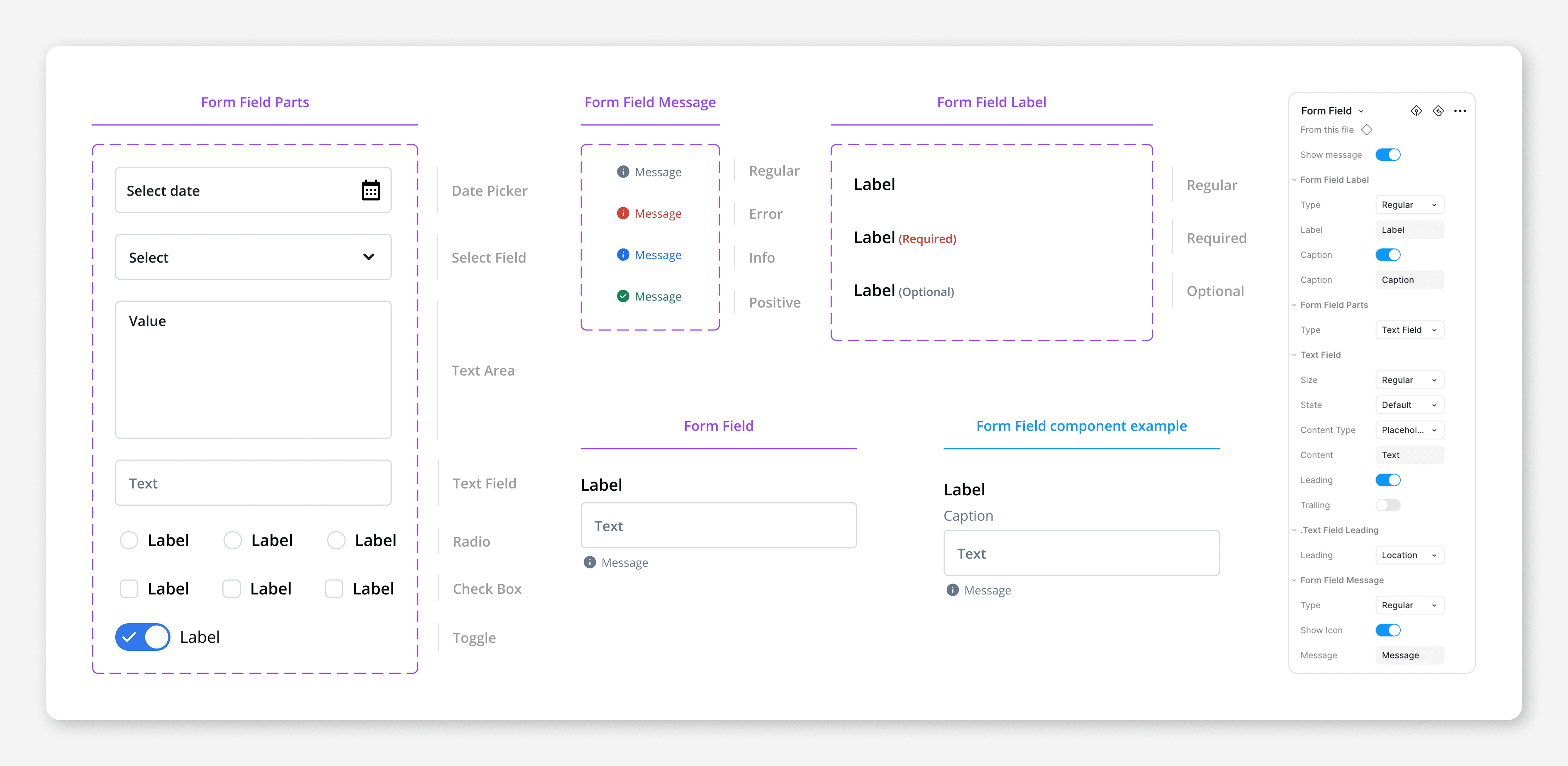
Form Field
Form Complex
Calendar
Tag
Chips
Tooltip
Slider
Row
Table
Message
Button Component
The main colors were selected first, with tints and shades generated via HSB adjustments and validated for accessibility using contrast checks.
Form Field Component
The main colors were selected first, with tints and shades generated via HSB adjustments and validated for accessibility using contrast checks.
Adoption Process
This design system is structured in a way that allows designers to adopt and scale UI patterns with clarity and ease. It's fully maintained in a dedicated Figma project.
Accessing the Library
Go to the Assets panel in Figma
Click "Team Libraries" and enable the relevant components and styles.
All tokens, components, and icons will then be available to use directly in your own design files.
How to Use It
Use components from the Components file directly—do not detach unless absolutely necessary.
Reference design tokens from Foundation.
Swap or search icons from the Icons file based on naming convention.
Contribution Process
The design system is open to improvements and new additions. Here’s how to contribute:
1. Identify a Need
Missing components or noticeable gaps.
Enhancements or bug reports for existing components.
A new need that isn’t solved by current components.
Reusable components that could benefit others and yourself.
2. Submit a Proposal
The use case and reasoning.
Optional mockups or examples.
Accessibility considerations.
Submit it via Figma comments or a shared feedback channel.
3. Review and Integration
The maintainer reviews your suggestion.
You’ll collaborate to refine it (if needed).
Once approved, the change is added to the system.
4. Versioning
All updates follow a simple changelog inside the Figma file.
Breaking changes include notes & migration tips.
Defining Success Metrics
Success Metrics
I defined success metrics to track adoption, consistency, efficiency, and quality. measuring how well the Design System integrates into workflows and improves the product.
Increase in DS Adoption
More teams using the system shows it’s valuable and trusted.
Component Usage Coverage
High component reuse shows consistency and less duplication.
Design & Dev Time Reduction
Faster delivery proves the system is improving efficiency.
Increase in UI Consistency Score
Consistent UI shows successful implementation.
Metrics
Reason I chose the metric
Increase in DS Adoption
More teams using the system shows it’s valuable and trusted.
Increase Component Usage Coverage
High component reuse shows consistency and less duplication.
Reduction in Design and Dev Time
Faster delivery proves the system is improving efficiency.
Increase in UI Consistency Score
Consistent UI across products signals successful implementation.
Reflection and Key Learnings
Even Small Notes Make a Difference
I realized that a good design system isn’t just visual. It also needs to be understandable. Clear documentation, even if it's just small, well-placed notes, can make a big difference in helping developers and other designers work with the system efficiently, especially when time is limited.
Learning to Think in Systems and for Scale
I learned how critical it is to think in systems and consider scalability at every step. When defining token names, I now ask, “What if there are 10 times more components, will this still hold?” This mindset also applies to component naming: instead of using color names like “primary” or “secondary,” for emphasis levels, it’s better to define them. Otherwise, if your brand introduces additional colors or themes, your naming structure quickly breaks down.
Foundation
Since this design system was made for a concept project, I focused on foundational design elements like:
Colors
Typography
Design Token Strategy
As part of building a scalable and maintainable design system, I established a naming convention for design tokens that works across different themes, components, and use cases. This convention was debated and refined in collaboration with a developer and another designer to ensure its effectiveness.
❌ What Didn’t Work: Component-Based Token Naming
At first, I experimented with component-based token naming alongside semantic general tokens. I implemented them, but it didn’t feel right. This structure made the system rigid, noisy, and hard to maintain. Problems I faced:
Repetition: Tokens were duplicated across components.
Scalability: As I added more components and states, the token list became overwhelming.
Poor reusability: Tokens were too tightly coupled to component names, making them less flexible.
✅ Transition to Semantic Token Naming
At first, I experimented with component-based token naming alongside semantic general tokens. I implemented them, but it didn’t feel right. This structure made the system rigid, noisy, and hard to maintain. Problems I faced:
Color Tokens
Generating Tints and Shades
The main colors were selected first, with tints and shades generated via HSB adjustments and validated for accessibility using contrast checks. Colors should be based on the brand color in real-world projects.
1. Primitive Tokens
Raw, brand-agnostic values — not tied to any component or usage context. Examples:
colors/neutral/neutral100
colors/red/red500
colors/blue/blue600
colors/green/green200
Naming Format: {category}/ {name}/ {nameX}
2. Semantic Tokens
These describe the role or meaning of a design decision. I grouped color tokens into the following categories:
colors/surface/*
static background areas (e.g. pages, cards)
colors/border/*
borders and outlines with no interaction
colors/content/*
icons and text colors
Naming Format: {category}/ {property}/ {concept}/ {variant}-{state}-{tone}
3. Color Document
I created a complete, categorized color token document to help designers quickly find and apply the right token. It’s structured by property (surface, border, content) and concept (neutral, system, brand) for clarity and consistency.
Icons
All icons were created as 24px components with consistent internal layer structure to support seamless swapping. I followed a naming convention that starts with
icon/to keep them grouped and easily searchable in Figma.Instead of naming icons based on meaning (e.g.,
search), I used visual descriptors (e.g.,magnifier) to reflect their appearance rather than their function. This makes the icon set more neutral, reusable, and easier to find.
Design Token Strategy
As part of building a scalable and maintainable design system, I established a naming convention for design tokens that works across different themes, components, and use cases. This convention was debated and refined in collaboration with a developer and another designer to ensure its effectiveness.
❌ What Didn’t Work: Component-Based Token Naming
At first, I experimented with component-based token naming alongside semantic general tokens. I implemented them, but it didn’t feel right. This structure made the system rigid, noisy, and hard to maintain. Problems I faced:
Repetition: Tokens were duplicated across components.
Scalability: As I added more components and states, the token list became overwhelming.
Poor reusability: Tokens were too tightly coupled to component names, making them less flexible.
✅ Transition to Semantic Token Naming
At first, I experimented with component-based token naming alongside semantic general tokens. I implemented them, but it didn’t feel right. This structure made the system rigid, noisy, and hard to maintain. Problems I faced:
Color Tokens
2. Semantic Tokens
These describe the role or meaning of a design decision. I grouped color tokens into the following categories:
colors/surface/*
static background areas (e.g. pages, cards)
colors/border/*
borders and outlines with no interaction
colors/content/*
icons and text colors
Naming Format:{category}/ {property}/ {concept}/ {variant}-{state}-{tone}
Generating Tints and Shades
The main colors were selected first, with tints and shades generated via HSB adjustments and validated for accessibility using contrast checks. Colors should be based on the brand color in real-world projects.
1. Primitive Tokens
Raw, brand-agnostic values — not tied to any component or usage context. Examples:
colors/neutral/neutral100
colors/red/red500
colors/blue/blue600
colors/green/green200
Naming Format: {category}/ {name}/ {nameX}
3. Color Document
I created a complete, categorized color token document to help designers quickly find and apply the right token. It’s structured by property (surface, border, content) and concept (neutral, system, brand) for clarity and consistency.
Icons
All icons were created as 24px components. I followed a naming convention that starts with
icon/to keep them grouped and easily searchable in Figma. View the figma file.
Icons
All icons were created as 24px components. I followed a naming convention that starts with
icon/to keep them grouped and easily searchable in Figma. View in Figma.
Components
Button
Checkbox
Toggle
Tag
Text Area
Chips
Date
Picker
Form
Field
Form
Complex
Select
Field
Radio
Button
Text
Field
Tooltip
Slider
Row
Table
Message
Calendar
Button Component
The main colors were selected first, with tints and shades generated via HSB adjustments and validated for accessibility using contrast checks.
Form Field Component
The main colors were selected first, with tints and shades generated via HSB adjustments and validated for accessibility using contrast checks.
Components
Button
Radio Button
Checkbox
Toggle
Text Field
Select Field
Date Picker
Text Area
Form Field
Form Complex
Calendar
Tooltip
Tag
Chips
Slider
Row
Table
Message
Form Field Component
The main colors were selected first, with tints and shades generated via HSB adjustments and validated for accessibility using contrast checks.
Button Component
The main colors were selected first, with tints and shades generated via HSB adjustments and validated for accessibility using contrast checks.
File management
I created a separate project in Figma to organize the design system. This made the structure more focused and allowed for better control of documentation, tokens, and components.
Typography Tokens
Technically, we could separate typography tokens into primitive and semantic layers, just like we do with colors. But in this project, I assumed typography styles would remain the same over time. That’s why I chose not to separate them and placed them directly in the typography collection to avoid repeating values unnecessarily. View in Figma.
Typography Document
I created a comprehensive typography token system and defined corresponding text styles, making it easy for both developers and designers to use them consistently in their work.
typography/display/*
typography/headline/*
typography/label/*
typography/body/*
Naming Format: {category}/ {concept}/ {size}/ {property}
Typography Tokens
Technically, we could separate typography tokens into primitive and semantic layers, just like we do with colors. But in this project, I assumed typography styles would remain the same over time. That’s why I chose not to separate them and placed them directly in the typography collection to avoid repeating values unnecessarily. View in Figma.
Typography Document
I created a comprehensive typography token system and defined corresponding text styles, making it easy for both developers and designers to use them consistently in their work.
typography/display
typography/headline
typography/label
typography/body
Naming Format: {category}/ {concept}/ {size}/ {property}
Building and Scaling a Design System in Figma
Focusing on Color and Typography Tokens and Components
Project Type: Self-Initiated
Role: Design system Designer
Duration: 5 Weeks
Team: 1 Designer and 1 Engineer
Reflection and Key Learnings
Even Small Notes Make a Difference
I realized that a good design system isn’t just visual. It also needs to be understandable. Clear documentation, even if it's just small, well-placed notes, can make a big difference in helping developers and other designers work with the system efficiently, especially when time is limited.
Learning to Think in Systems and for Scale
I learned how critical it is to think in systems and consider scalability at every step. When defining token names, I now ask, “What if there are 10 times more components, will this still hold?” This mindset also applies to component naming: instead of using color names like “primary” or “secondary,” for emphasis levels, it’s better to define them. Otherwise, if your brand introduces additional colors or themes, your naming structure quickly breaks down.
Adoption Process
This design system is structured in a way that allows designers to adopt and scale UI patterns with clarity and ease. It's fully maintained in a dedicated Figma project.
Accessing the Library
Go to the Assets panel in Figma
Click "Team Libraries" and enable the relevant components and styles.
All tokens, components, and icons will then be available to use directly in your own design files.
All tokens, components, and icons will then be available to use directly in your own design files.
How to Use It
Use components from the Components file directly—do not detach unless absolutely necessary.
Reference design tokens from Foundation.
Reference design tokens from Foundation.
Swap or search icons from the Icons file based on naming convention.
Swap or search icons from the Icons file based on naming convention.
Adoption Process
This design system is structured in a way that allows designers to adopt and scale UI patterns with clarity and ease. It's fully maintained in a dedicated Figma project.
Accessing the Library
Go to the Assets panel in Figma
Click "Team Libraries" and enable the relevant components and styles.
All tokens, components, and icons will then be available to use directly in your own design files.
Use components from the Components file directly—do not detach unless absolutely necessary.
Reference design tokens from Foundation.
Swap or search icons from the Icons file based on naming convention.
How to Use It
Contribution Process
The design system is open to improvements and new additions. Here’s how to contribute:
1. Identify a Need
Missing components or noticeable gaps.
A new need that isn’t solved by current components.
Reusable components that could benefit others and yourself.
Enhancements or bug reports for existing components.
2. Submit a Proposal
The use case and reasoning.
Optional mockups or examples.
Accessibility considerations.
Submit it via Figma comments or a shared feedback channel.
3. Review and Integration
The maintainer reviews your suggestion.
You’ll collaborate to refine it (if needed).
Once approved, the change is added to the system.
4. Versioning
All updates follow a simple changelog inside the Figma file.
Breaking or major changes include notes and migration tips.
Key Learnings
Even Small Notes Make a Difference
I realized that a good design system isn’t just visual. It also needs to be understandable. Clear documentation, even if it's just small, well-placed notes, can make a big difference in helping developers and other designers work with the system efficiently, especially when time is limited.
Learning to Think in Systems and for Scale
I learned how critical it is to think in systems and consider scalability at every step. When defining token names, I now ask, “What if there are 10 times more components, will this still hold?” This mindset also applies to component naming: instead of using color names like “primary” or “secondary,” for emphasis levels, it’s better to define them. Otherwise, if your brand introduces additional colors or themes, your naming structure quickly breaks down.
Defining Success Metrics
I defined success metrics to track adoption, consistency, efficiency, and quality. measuring how well the Design System integrates into workflows and improves the product.
Metrics
Reason I chose the metric
Increase in DS Adoption
More teams using the system shows trust and value.
Component Usage Coverage
High component reuse shows consistency.
Design & Dev Time Reduction
Faster delivery shows improved efficiency.
UI Consistency Score
Consistent UI shows successful implementation.